NCERT Solutions for Class 9 Maths Chapter 14 Statistics Ex 14.3 are part of NCERT Solutions for Class 9 Maths. Here we have given NCERT Solutions for Class 9 Maths Chapter 14 Statistics Ex 14.3.
| Board | CBSE |
| Textbook | NCERT |
| Class | Class 9 |
| Subject | Maths |
| Chapter | Chapter 14 |
| Chapter Name | Statistics |
| Exercise | Ex 14.3 |
| Number of Questions Solved | 9 |
| Category | NCERT Solutions |
NCERT Solutions for Class 9 Maths Chapter 14 Statistics Ex 14.3
Question 1.
A survey conducted by an organisation for the cause of illness and death among the women between the ages 15-44 (in years) worldwide, found the following figures (in %)
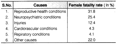
(i) Represent the information given above graphically.
(ii) Which condition is the major cause of women’s ill health and death worldwide?
(iii) Try to find out, with the help of your teacher, any two factors which play a major role in the cause in (ii) above being the major cause.
Solution:
(i) We draw the bar graph of this data in the following steps. Note that, the unit in the second column is percentage.
- We represent the causes (variable) on the horizontal axis choosing any scale, since width of the bar is not important but for clarity, we take equal widths for all bars and maintain equal gaps in between. Let on cause be represented by one unit.
- We represent the female fatality rate (value) on the vertical axis. Here, we can choose the scale as 1 unit = 4%.
- To represent our first cause i.e, reproductive health conditions, we draw & rectangle bar with width 1 unit and height 31.8 units.
- Similarly, other heads are represented leaving a gap of 1 unit in between two consecutive bars.
Now the graph is drawn in figure.
(ii) From graph, we observe that ‘reproductive health conditions’ is the major cause of women’s ill health and death world wide because it has maximum percentage among the causes i.e.,31.8%.
Question 2.
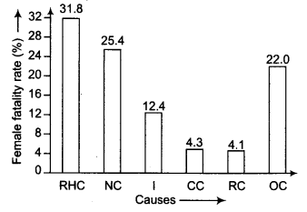
The following data on the number of girls (to the nearest ten) per thousand boys in different sections of Indian society is given below
(i) Represent the information above by a bar graph.
(ii) In the classroom discuss, what conclusions can be arrived at from the graph.
Solution:
(i) We draw the bar graph of this data, note that the unit in the second column is number of girls per thousand boys.
We represent the section on the horizontal axis choosing any scale, since width of the bar is not important but for clarity, we take equd widths for all bars and maintain equal gaps in between. Let on section be represented by one unit.
We represent the number of girls per thousand boys on the vertical axis.
Now, the graph is drawn in figure.
We represent the number of girls per thousand boys on the vertical axis. Here, we can choose the scale as 1 unit = 100.
Now, the graph is drawn in figure
(ii) From graph, we observe that scheduled tribe (ST) number of girls is major section in different sections of Indian society, because it has maximum number of girls per thousand boys i.e., 970.
Question 3.
Given below are the seats won by different political parties in the polling outcome of a state assembly elections
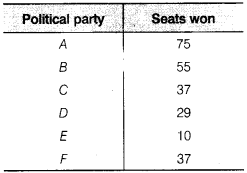
(i) Draw a bar graph to represent the polling results.
(ii) Which political party won the maximum number of seats?
Solution:
We draw the bar graph of this data, note that the unit in the second column is seats won by political party.
(i) We represent the political party on the horizontal axis choosing any scale, since width of the bar is not important but for clarity, we take equal widths for all bars and maintain equal gaps in between. Let on political party be represented by one unit.
(ii) We represent the seats won on the vertical axis. Here, we can choose the scale as 1 unit = 10
Now, the graph is drawn in figure
Party ‘A’ Won the maximum number of seats. i.e, 75.
Question 4.
The length of 40 leaves of a plant measured correct to one millimetre and the obtained data is represented in the following table
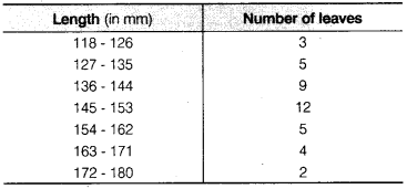
(i) Draw a histogram to represent the given data.
(ii) Is there any other suitable graphical representation for the same data?
(iii) Is it correct to conclude that the maximum number of leaves 153 mm long and Why?
Solution:
(i) We know that, the areas of the rectangles are proportional to the frequencies in a histogram. Now, we get the following modified table by given data
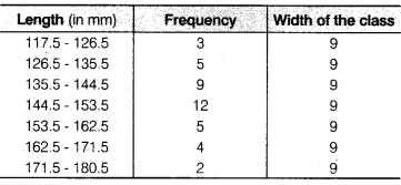
Now, we draw the histogram for given data
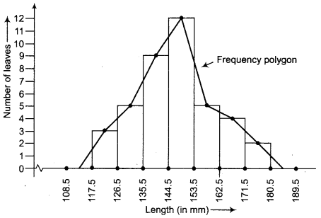
(ii) Frequency polygon.
(iii) No, because the maximum number of leaves have their lengths lying in
the interval 145-153.
Question 5.
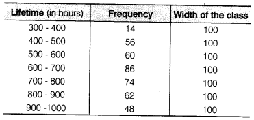
The following table gives the lifetimes of 400 neon lamps
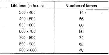
(i) Represent the given information with the help of a histogram.
(ii) How many lamps have a lifetime of more 700 h?
Solution:
(i) Here, we will make a modified table by given data.
Now, we draw the histogram for above table
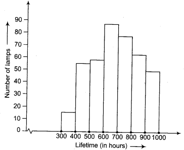
(ii) 184 lamps have a life time of more than 700 h i.e.,74 + 62 + 48 = 184.
Question 6.
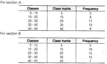
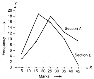
The following table gives the distribution of students of two sections according to the marks obtained by them
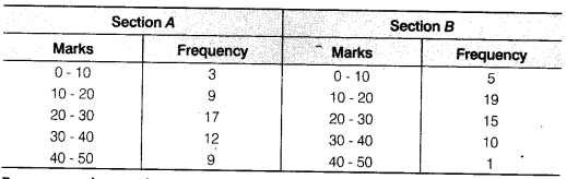
Represent the marks of the students of both the sections on the same graph by two frequency polygons. From the two polygons compare the performance of the two sections.
Solution:
Here, we make modified tables by given data.
Now, required frequency polygon curves are
Question 7.
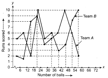
The runs scored by two teams A and B on the first 60 balls in a cricket match are given below
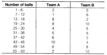
Represent the data of both the teams on the same graph by frequency polygons.
Solution:
First make the class intervals continuous.
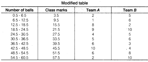
Now, draw a frequency polygon curve
Question 8.
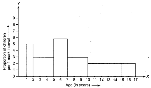
A random survey of the number of children of various age groups playing in a park was found as follows
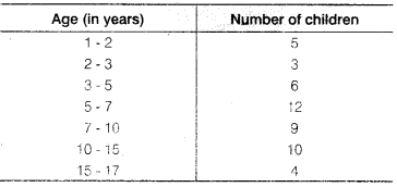
Draw a histogram to represent the data above.
Solution:
We know that, the areas of the rectangles are proportional to the frequencies in a histogram. Here, the widths of the rectangles are varying. So, we need to make certain modifications in the lengths of the rectangles, so that the areas are again proportional to the frequencies.
- Select a class interval with the minimum class size. The minimum class size is 1.
- The lengths of the rectangles are then modified to be proportionate to the class size
Now, we get the following table
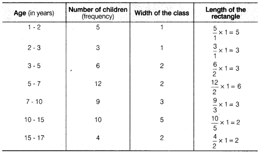
So, the correct histogram with varying width is given below.
Question 9.
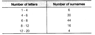
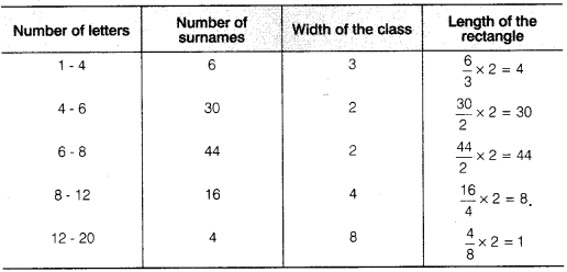
100 surnames were randomly picked up from a local telephone directory and a frequency distribution of the number of letters in the English alphabet in the surnames was found as follows
(i) Draw a histogram to depict the given information.
(ii) Write the class interval in which the maximum number of surnames lie.
Solution:
(i) We know that, the areas of the rectangles are proportional to the frequencies in a histogram. Here, the widths of the rectangles are varying. So, we need to make certain modifications in the lengths of the rectangles. So that the areas are again proportional to the frequencies.
- Select a class interval with the minimum class size. The minimum class size is 2.
- The lengths of the rectangles are then modified to be proportionate to the class size 2.
Since we have calculated these lengths for interval of 2 letters in each case, we may call these lengths as ‘proportion of surnames per 2 mark ‘ interval’.
So, the correct histogram with varying width is given below.
Here, we make a modified table by given data with minimum class size 2.
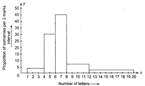
(ii) The class interval in which the maximum number of surnames lie is 6-8.
We hope the NCERT Solutions for Class 9 Maths Chapter 14 Statistics Ex 14.3 help you. If you have any query regarding NCERT Solutions for Class 9 Maths Chapter 14 Statistics Ex 14.3, drop a comment below and we will get back to you at the earliest.